ここではtableレイアウトのサンプルをご紹介します。デザインの参考にしてください。
コンテンツ
線だけのシンプルなテーブル
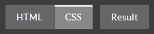
ボタンで表示を切り替えてご覧ください。
See the Pen table01 by kenichi (@ken81) on CodePen.
CSS
td,th{
  border-top:1px solid #666;
  padding:10px;
}
tr:last-child td,
tr:last-child th{
  border-bottom:1px solid #666;
}
セルのトップに線を表示させます。最後の行のみボトムに線を表示させたいので擬似クラスlast-childを使用しました。
線をさらにシンプルにしたテーブル
See the Pen table11 by kenichi (@ken81) on CodePen.
CSS
table{
  border-collapse:collapse;
  margin:0 auto;
}
th{
  border-bottom:2px solid #000;
}
td,th{
  padding:10px;
}
th要素の下に線を入れただけのシンプルなデザインです。
見出しセルだけ色を付けたテーブル
See the Pen table14 by kenichi (@ken81) on CodePen.
CSS
table{
  border-collapse: separate;
  border-spacing: 5px 0;
  margin: 0 auto;
}
td,th{
  padding: 10px;
}
th{
  color: #fff;
  background: #005ab3;
  border-radius: 5px;
}
td{
  color: #005ab3;
}
あまり凝ったことをしなくても、結局、シンプルなデザインに落ち着くというのはよくあることです。これもシンプルだけど一色だけなので統一感があります。
線をダッシュにして少し装飾したテーブル
See the Pen table02 by kenichi (@ken81) on CodePen.
CSS
td{
  border-bottom:1px dashed #999;
}
th,tr:last-child td{
  border-bottom:2px solid #005ab3;
}
ポイントは上記のスタイルシートです。td要素のボトムにダッシュ線を表示されます。項目セル(th)とtd要素の最後の行だけ青い線にしました。
見出しの背景にストライプを入れたテーブル
See the Pen table12 by kenichi (@ken81) on CodePen.
CSS
table{
  border-collapse:collapse;
  margin:0 auto;
  color:#005ab3;
}
tr:last-child td{
  border-bottom:2px solid #005ab3;
}
td,th{
  padding:10px;
}
tr:first-child{
    background-image: linear-gradient(
    -45deg,
    #C6E6FB 15%, #fff 15%,
    #fff 25%, #C6E6FB 25%,
    #C6E6FB 65%, #fff 65%,
    #fff 75%, #C6E6FB 75%,
    #C6E6FB
  );
  background-size: 15px 15px;
}
スタイルシートのみでth要素の背景に斜めのストライプを入れたデザインです。ストライプのデザインについては下記もご参照ください。

行に交互の背景色を設定したテーブル
See the Pen table03 by kenichi (@ken81) on CodePen.
CSS
table tr:nth-child(odd){
  background:#e6f2ff;
}
“odd”というのは英語で「奇数」という意味です。nth-child(odd)という疑似クラスを使って奇数番目のtr要素のみ背景色を入れることでシマシマが表現されます。最初のth要素も「奇数」に該当するので薄青い背景色が効いているのですが、tr要素の子どもであるth要素の方が上に重なっているためth要素に指定した色が表示されています。
交互の背景色に線を入れたテーブル
See the Pen table02 by kenichi (@ken81) on CodePen.
CSS
td{
  border-bottom:2px solid #80bcff;
}
上のテーブルに上記のスタイルシートを追加してセルのボーダーに線を表示させました。
列に交互の背景色を設定したテーブル
See the Pen table04 by kenichi (@ken81) on CodePen.
CSS
table tr td:nth-child(odd){
  background:#e6f2ff;
}
先ほどは、tr要素に効かせていた擬似クラスをtd要素に変えることでシマシマがタテに変わります。
すべての列をシマシマにしたテーブル
See the Pen table05 by kenichi (@ken81) on CodePen.
CSS
table tr th:nth-child(odd),
table tr td:nth-child(odd){
  background:#e6f2ff;
}
上記のようにth要素にも擬似クラスnth-child(odd)を効かせるとテーブル全体がタテジマ模様になります。
項目にアクセントを入れたテーブル
See the Pen table06 by kenichi (@ken81) on CodePen.
テーブルそのものはシンプルですが、
CSS
th{
  border-left:5px solid #005ab3;
  color:#005ab3;
}
で項目の左に線が入っているのでアクセントになっています。
無難にシンプルなテーブル
See the Pen table07 by kenichi (@ken81) on CodePen.
CSS
th{
  background:#EFEFEF;
}
上記のスタイルシートで項目に薄い背景色を入れただけのよくあるテーブルです。
トップにアクセントを入れたテーブル
See the Pen table06 by kenichi (@ken81) on CodePen.
CSS
tr:first-child th{
  border-top:5px solid #005ab3;
}
tr:first-child td{
  border-top:5px solid #ccc;
}
先ほどのシンプルなテーブルに上記のスタイルを入れただけでも印象が変わるから面白いですね。
ラベル風のテーブル
See the Pen table13 by kenichi (@ken81) on CodePen.
CSS
table{
  border-collapse: separate;
  border-spacing: 0px 5px;
  margin: 0 auto;
}
td,th{
  padding: 10px;
}
th{
  background: #10a0e0;
  color: #fff;
}
td{
  background: #f1fafe;
}
border-collapse: separate;でボーダーの間隔をあけて表示し、さらにborder-spacing: 0px 5px;でボーダーの間隔を指定しているところがポイントです。
タイル風のテーブル
See the Pen table15 by kenichi (@ken81) on CodePen.
CSS
table{
  border-collapse: separate;
  border-spacing: 5px;
  margin: 0 auto;
}
td,th{
  padding: 10px;
  text-align: center;
}
th:first-of-type,
td:first-of-type{
  background: #b2ffd8;
}
th:nth-of-type(1),
td:nth-of-type(1){
  background: #d1ffd1;
}
th:nth-of-type(2),
td:nth-of-type(2){
  background: #e8ffd1;
}
th:nth-of-type(3),
td:nth-of-type(3){
  background: #ffffd1;
}
th:nth-of-type(4),
td:nth-of-type(4){
  background: #ffe8d1;
}
:nth-of-type(n)という擬似クラスを利用してタイルをパステルカラーで色分けしてみました。
難易度が高い角丸テーブル
See the Pen kadomaru-table06 by kenichi (@ken81) on CodePen.
これはテーブルの四つ角を丸めたバージョンです。これは結構ややこしいスタイルシートでできています。詳しい作り方を知りたい方は下記をご覧ください。

以上、テーブルのデザインサンプルでした。
ところで見出し付きのボックスデザインなんかにも興味はありますか?
良かったら下記の記事もご覧になってみてください。